RWS Web
December 12, 2019
| Employer | OneMarket Network |
| Project Dates | Mar-Nov 2019 |
| Technologies | NodeJs/Express, React, Styled Components, TypeScript, Apollo (GraphQL), PostgreSQL, Parcel, Ramda, server-side rendering |
| Testing | Jest, Enzyme |
| CI/CD | CircleCI |
| Team | 2 engineers, 1 engineering product |
OneMarket Network is a customer activation platform. The pitch:
Seamlessly unify your data, easily make sense of it, and quickly activate engagements for more meaningful and profitable relationships with customers - all in a single platform.
The company closed its doors on December 3, 2019, which halted this project.
My contributions
It’s important to note the team did NOT have a design resource. About 99% of the components (UI + UX), information architecture, and page layouts were designed and implemented by me. I purposefully made everything very simple so it would be easy to update the components (and global styles) or swap them out with something that suits the future design’s requirements.
Also, the team is very small. To break it down, there were two engineers, me being the frontend, and one other doing primarily the backend. This isn’t to say I didn’t work across the stack; I also wrote queries and mutations for feature requests. The backend engineer also added in some pages and additional features to existing parts of the app at times too.
Roles
If I have to break the work down to heavier frontend/backend tasks, they look like this:
- Frontend: Routing, app architecture, components, page composition, templating/reusability
- Backend: GraphQL framework (automating resolver generation, auth, data caching, plugin architecture)
As a side note, the backend portion of RWS Web exists in an entirely different repository. We called that RWS Server (very creative).
Specifications
We didn’t have a traditional product manager for our team. Instead, the VP of Engineering managed the schedule and was in charge of writing the stories. The stories were merely descriptions of a user experience, allowing the engineers the technical freedom to do whatever they deemed feasible. The mantras of engineering:
- Do it quick (don’t spend too much time on it)
- Do it simple (remove complexity)
In other words, there was a lot of autonomy and the team would be broken if the members weren’t capable of working without a lot of direction.
What is RWS Web?
The internal project name RWS Web is short for Retailer Web Services, the platform handling all things related to partners (our customers), storing their user data, allow access to APIs, and service configurations.
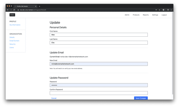
The web portion is the frontend facing UI/UX used by our partners to set up their organization with our services. In short, it is a self-serve portal enabling partners to register and sign up for our products without the need of any assistance.
Note: The customer-facing name was never finalized, and neither were the designs. Hence why the screencaps still have an awkward “RWS” in the header (something that means nothing to customers) and skeleton designs.
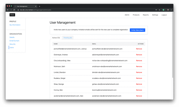
The goal is to provide a tool easy enough to use that greatly reduces the amount of time our onboarding staff will have to spend with each partner. Of course, if required, onboarding staff will have additional tools to sign on and assist with the partner setup. This will operate more like a customer support role.
For some context, our previous partner onboarding experience required too much hand-holding and several configurations had to be done outside of what the portal offered. Exposing virtually all configurations in an application not only makes setup more transparent, but enables partners to edit/see their settings at their bidding.
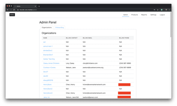
The benefits of a self-serve tool are:
- Fewer resources tied up for partner onboarding and training
- Small/medium businesses can self-register and try the service
- Partner visibility and access to their service configurations
Onboarding Context
As mentioned above, RWS Web still allowed internal onboarding staff to support partners needing assistance. Only users with the assigned role “onboarding” can be assigned a list of organizations to support.
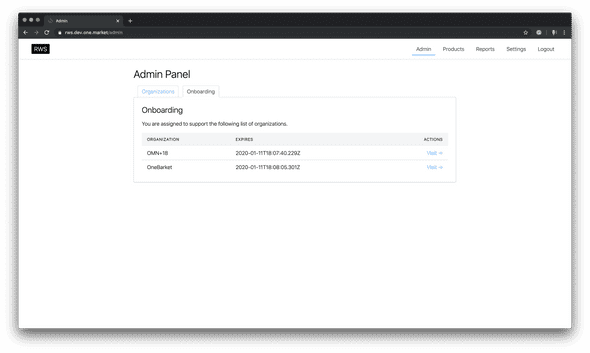
Selecting “Visit” for a partner will change the onboarding user’s organizational context.
To indicate what context the onboarding staff is in, I added the following changes to the header:
- A deep mustard background
- Name of the organization currently being supported
- Slightly different navigation. Onboarding cannot access “Reports” (a data analytics dashboard).
- Ability to exit onboarding context and return to the admin panel
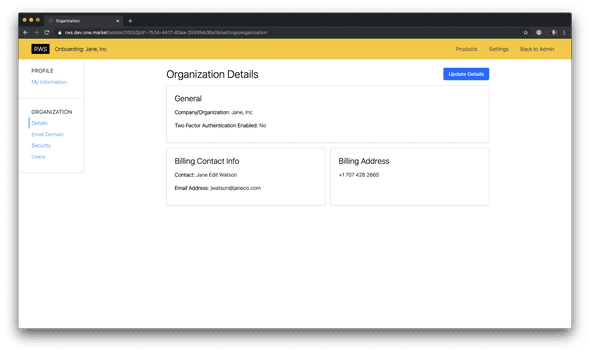
When a signed-in user sees this UI header change, they will know they are currently supporting a partner.
Struggles
With every project comes some struggles. Some can be seen upfront whereas others linger deeper in the code.
Lack of designer
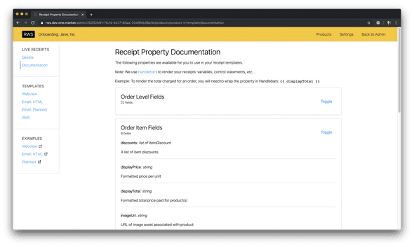
Putting aside the simplistic design, it was most apparent in the product configuration pages. Specifically, one of the products we called “Live Receipts” allows partners to customize the look and feel of their email and webview receipts.
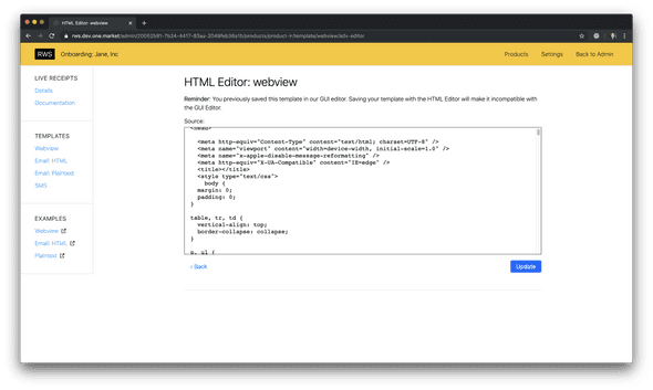
The problem? We didn’t know who we were catering to and didn’t know how to design the experience (or I didn’t know how I was supposed to make the experience).
Because of this, I provided two options:
- A textarea copy/paste field to store a source (for more technical customers)
- A GUI drag/drop of various components available for the partner to add on a receipt (for non-technical customers)
For the latter, I ended up integrating a third-party tool that satisfied the bare minimum requirements for allowing someone to drag/drop elements and edit CSS styles. This UX wasn’t ideal because users still had to manually write in the handlebars variables into the sections of the template. (Apologies, I don’t have a screencap of this). This entirely didn’t make sense if we wanted to use this for non-technical people.
However, I didn’t think it was feasible to write up a whole drag/drop experience or pay for something we’re unsure about, so we decided to wait to see how customers will respond before spending more time on it.
Product?
It was unclear who was driving the product direction for this project. I think at this point, there was a lot of internal conflicts/politics between the engineering team and product team. It was a bit uncomfortable for me because I have previously been working very closely with the product team, so I kept approaching the product person who I thought was going to cover this project with questions.
It ended up not being the case and it was very unclear to me who/what/why there wasn’t transparency around this. I think it brought team morale down.
Upsides
I learned and got to play with a lot of new technologies and learned new things!
- Apollo (GraphQL implementation): Completely removed our need to implement a separate state management system (like redux). I love it so much!
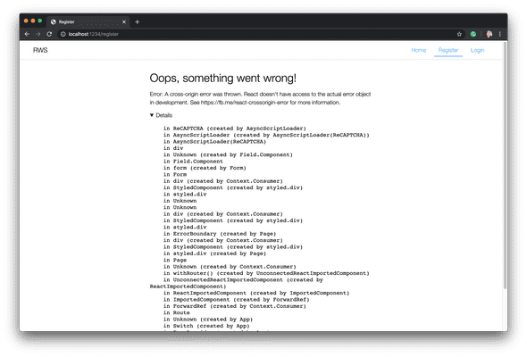
- React Hooks: specifically, my favorite is “error boundaries” on both the global and component scale!
Conclusion
I didn’t get to see this project run its course and get used by actual customers, but I got to learn a lot about new tools and loved the level of autonomy. It’s a bit refreshing to be able to simply push out new things from scratch and not worry about fixing layouts to meet design needs (just yet, but I do love the design iteration process too). This felt purely like an engineering exercise with the latest and greatest and I couldn’t be happier to be a part of it.